

Design System, Desktop Product
Gameloop Design System
Overview
Build a new design system from scratch to enhance user experience and improve design quality & productivity.
Outcome
Reduce design delivery time by 20% and negative feedback from users by 30%
Timeline
2021.7-2021.9
Tool
Figma, Excel
Role
Researcher, Intern Designer
Introduction
Tencent Gameloop, the best Android game emulator since 2018, provides players with a better gaming experience and easier access to playing the latest and high-quality mobile games on PC. With unique game sources and over 50 million monthly active users worldwide, GameLoop is the official Android emulator for PUBG Mobile, Call of Duty Mobile, Arena of Valor, and supports over 1000 popular games.

Context
When I joined Gameloop as an intern designer, the product went through a rapid change from a simple emulator to a one-stop comprehensive gaming platform. However, I am on a team with limited resources, which has resulted in inconsistent experience within the product and has caused negative user feedback. Some problems include:
📎
During rapid growth, many custom components were created by different designers under different scenarios, leading to inconsistency.
📏
Designers have no guidelines when choosing and creating components, which causes inappropriate even wrong choices.
♾️
Designers and engineers must attend many meetings, which improves communication costs and influences efficiency.
With the recent revamp of Gameloop's brand image, logo, and visual system, we have a unique opportunity to develop a design system that not only aligns with the new brand identity but also addresses the existing design challenges.

Goal
Although designers know a design system may solve these problems, we still set the goals for measuring the outcome. By building a design system for Gameloop, we want to:

Process
1. Talking with stakeholders
Creating a design system is a strategic and transformative process that requires support from the entire group. So, we bring together product managers, designers, marketing professionals, engineers, and executives to gather insights and shape the design system.
We found that product managers want the design quickly, and engineers hate making 0-1 features. We also gathered feedback about current experience problems and people's wish for an easy-access design system.
2. Audit the current design
I went through Gameloop and reviewed all various front-end design elements. Many inconsistencies emerged, including numerous redundant widgets and components created independently by our team members, which broke the experience and caused negative user feedback.

I screenshot everything page with misused components. So many!


Existing components designed in different layout, shape, color and format
I identified and corrected a range of flaws in the design, such as inconsistencies, incorrect language use, duplicated assets, and incorrect fonts and colors. To ensure they don't happen again, I created a set of guidelines highlighting what to do and what not to do when designing for GameLoop. I also built a catalog of UI components and visual elements that form the foundation of the design system.

A detailed classification of existing controls in Gameloop.
After addressing the existing issues, I created a comprehensive document that labeled all assets and variants in GameLoop. We also documented the modifications we made to the current design to ensure they were properly tracked. I summarized my findings and conclusions into a report and shared them with the design team to get their suggestions.
3. Define design language
After resolving all issues, I collaborated with the user research team to find out more about our target users and the games they play.


Most of our users are students who have no access to computers; based on our target user group, the design system and language should be:
🔎
Accurate
👥
Friendly
♾️
Consistent
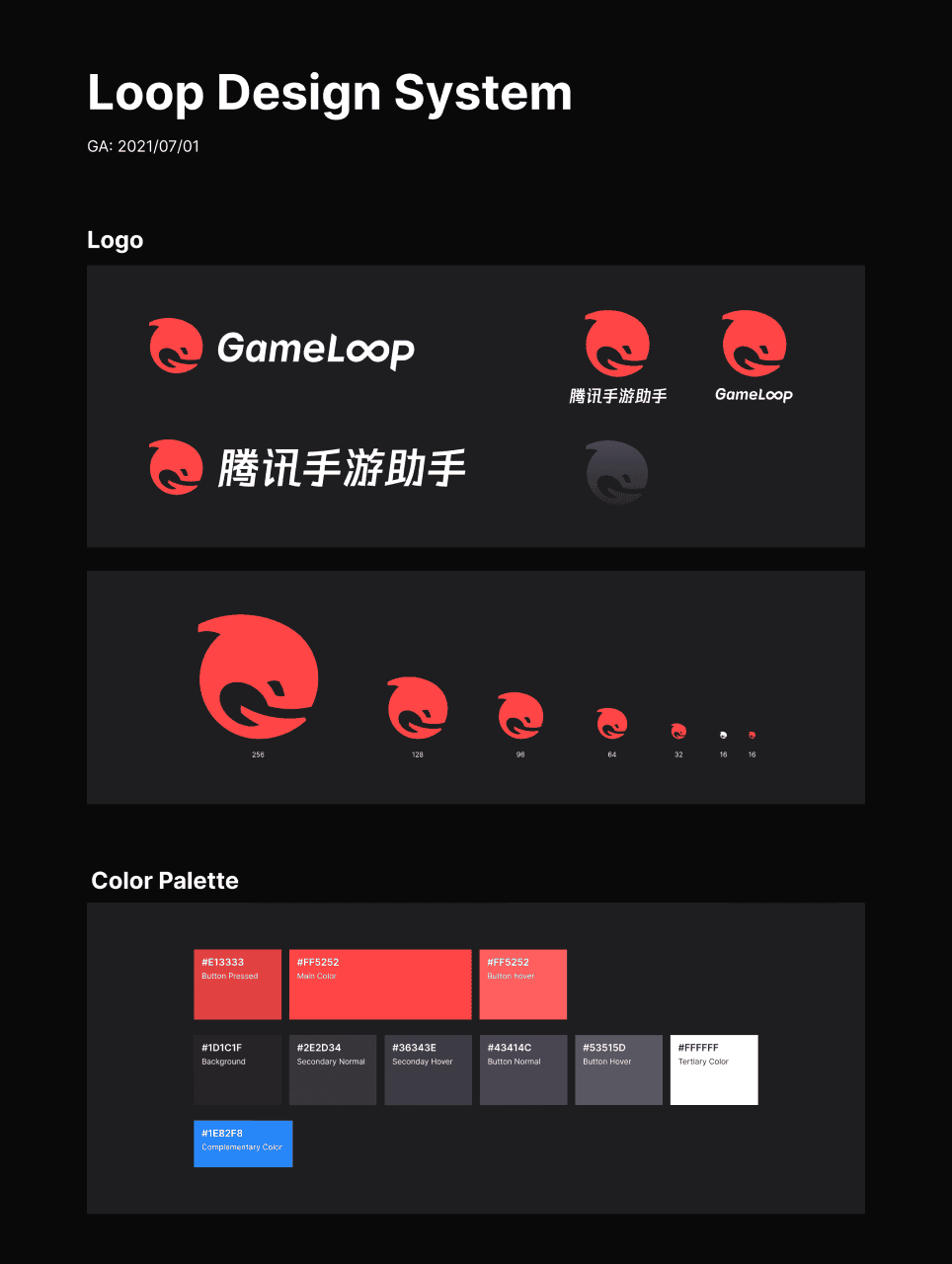
Then I collaborated with the brand team to ensure the user interfaces aligned with the newly created brand style guide. We aimed to reinforce the competitive E-Sport atmosphere of GameLoop by using a red-themed color palette and sharper widget angles in the new design.
Final Design

Structural layer & Padding
The structural layer and layout have been slightly changed. A basic grid and layout system has been established to prioritize the game. Responsive design guidelines are set to ensure the quality of the picture.
32px

40px 16px Material Design System Standard
Scroll to see whole page ⬇️

1200*700px
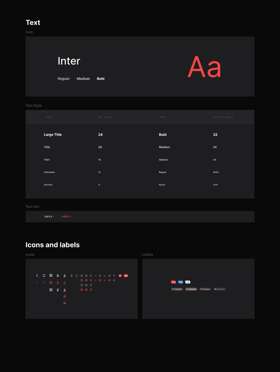
Font

Color
Tertiary Color
Complementary Color
Button hover
Main Color
Button Pressed
Button Hover
Button Normal
Secondary Hover
Secondary Normal
Background
Icon
24 * 24
16 * 16
4. Build pattern library
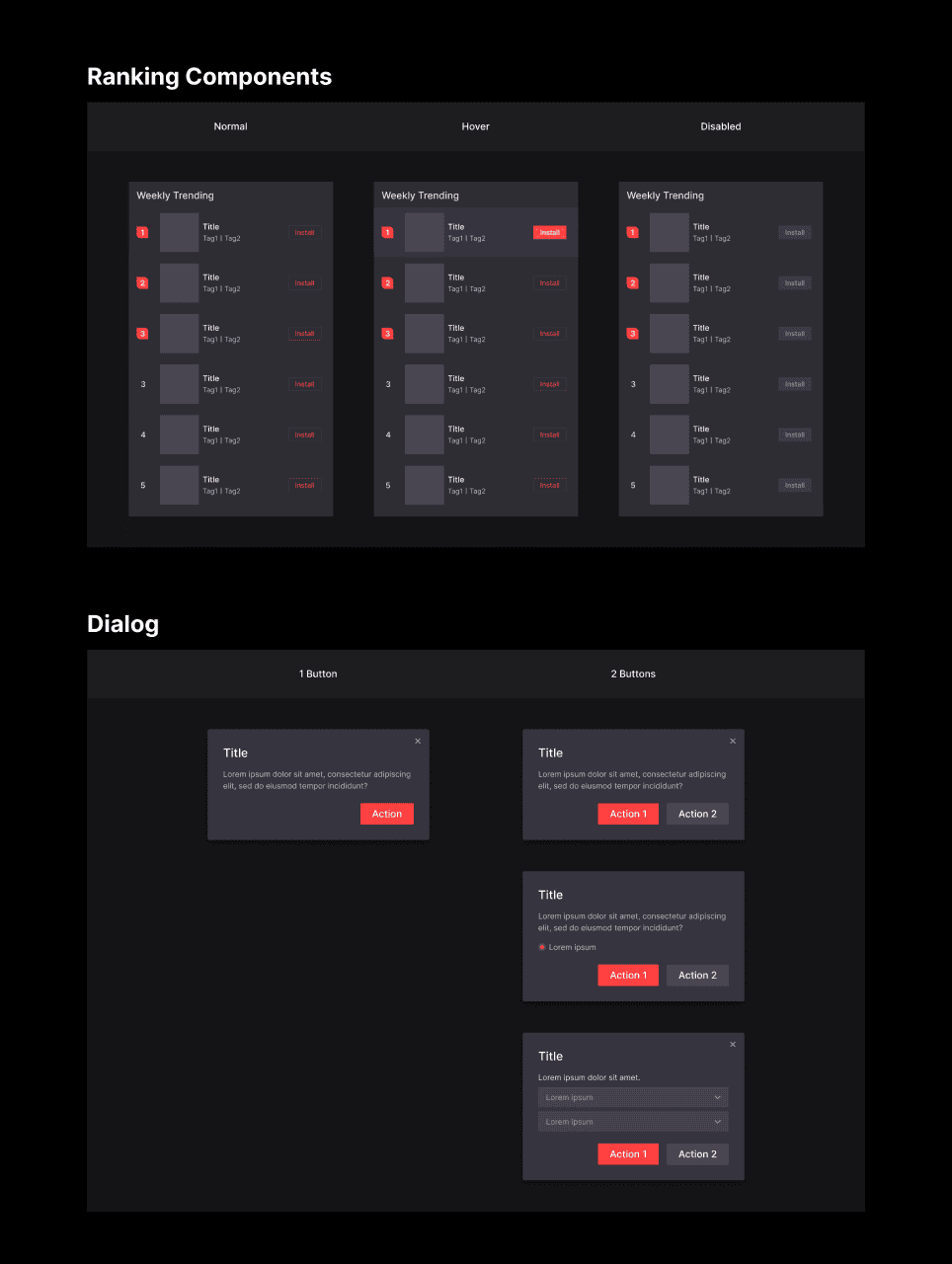
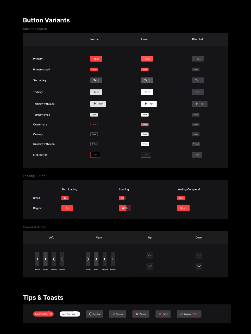
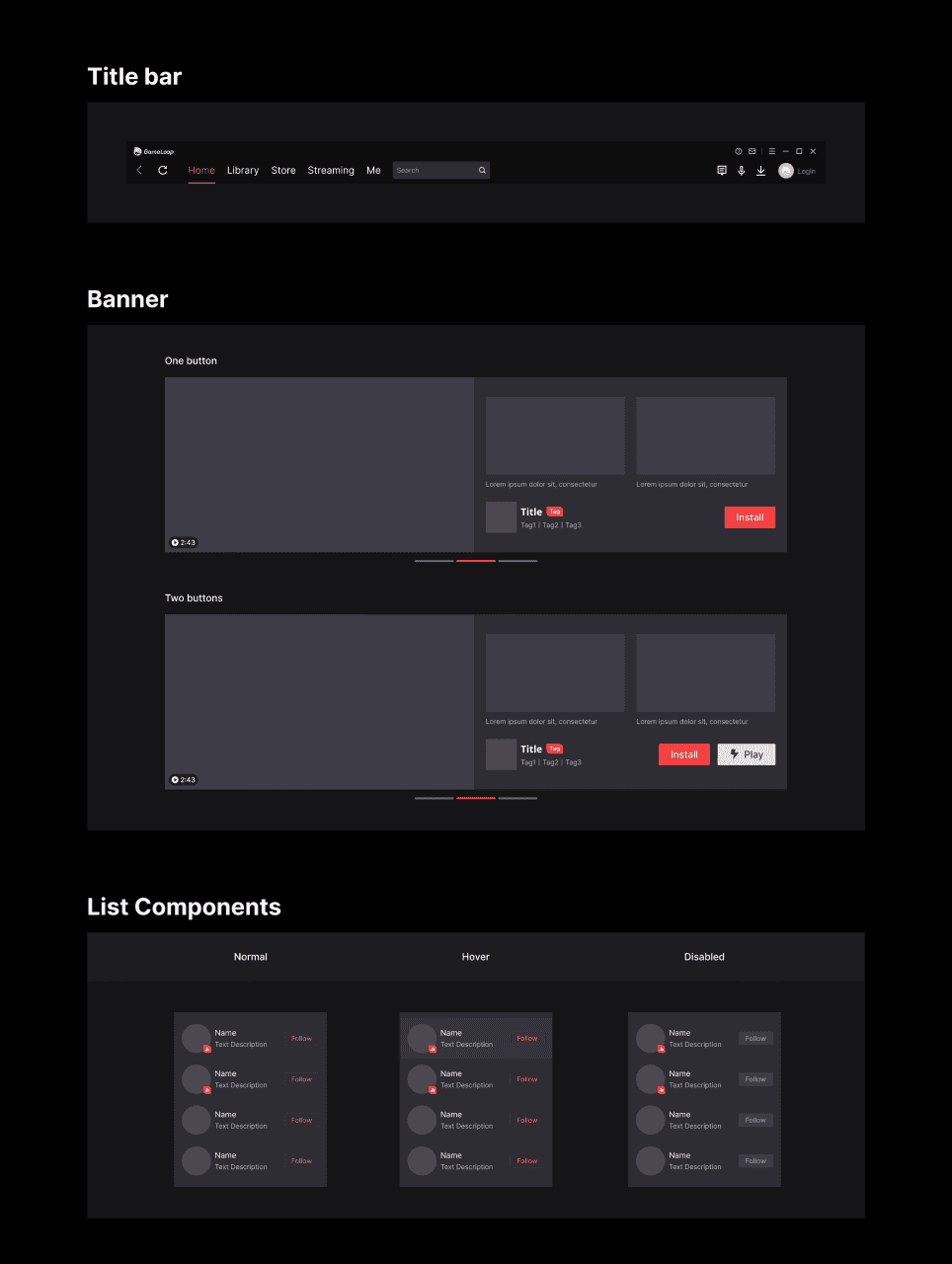
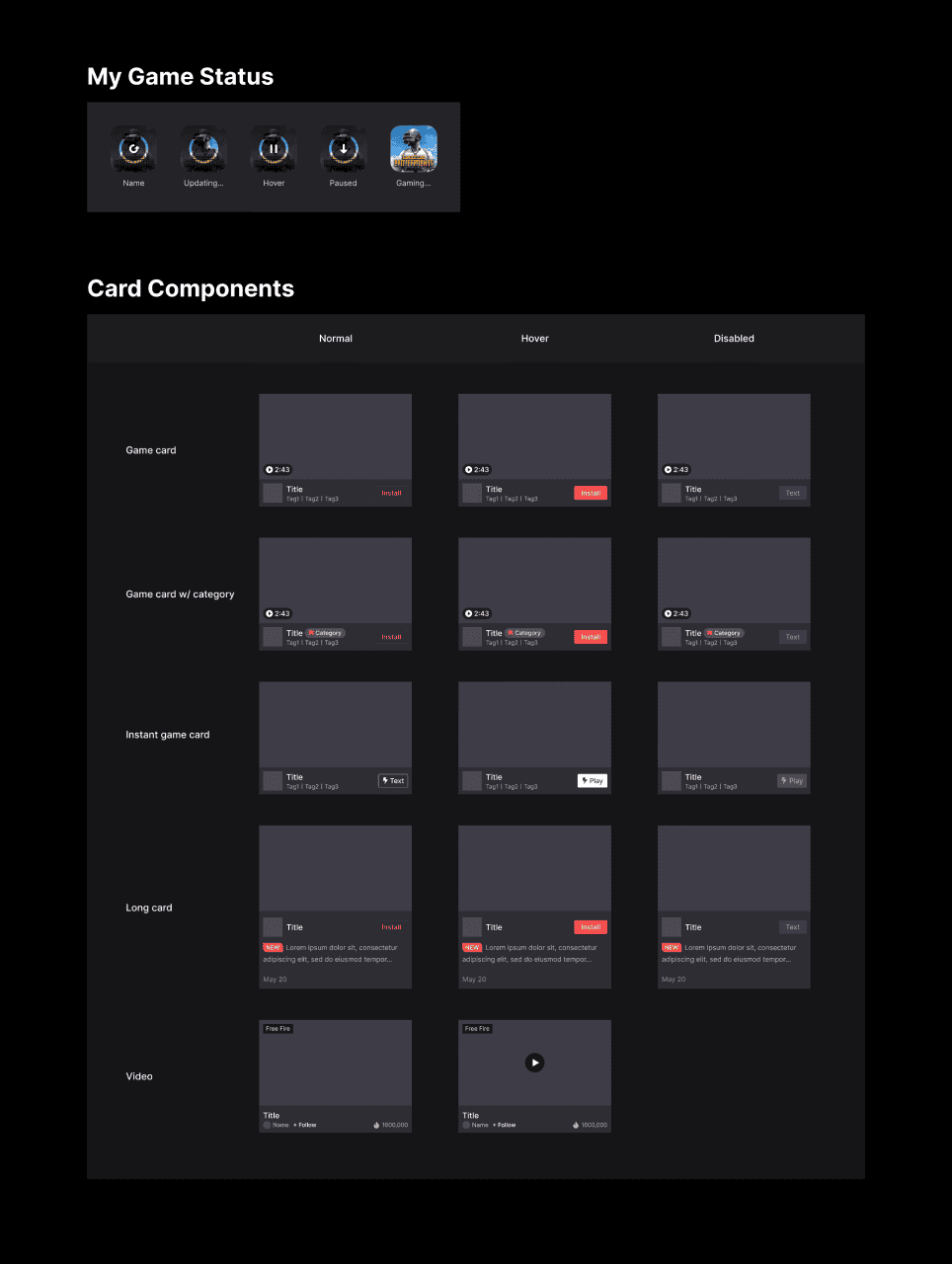
Once the interfaces were updated, I built the design system from scratch using the document created earlier, including a collection of reusable UI components that will streamline design in the future. Considering that the previous control classification of Gameloop was too complicated, I simplified the classification and unified their design in the same category.
Card


Title Bar

Banner

List

Ranking List

Tips & Toasts

Dialog


5. Document guidelines for reference
The design system works only if people use it. I set up guidelines for different components in Gameloop, which consists of 4 parts: introduction, usage scenarios, components, and layout. This will help designers choose the right components for new designs under different scenarios. At the same time, engineers and product managers will also get an idea of how the pages are created. Also, I built a document to log the changes made to each component for future reference.

Takeaway
1. Design is changeable based on context.
The design system for each stage of a product's life cycle is different. The Gameloop Design System is the solution to the problems we are facing now, so it's important to understand the design goal before pursuing it.
2. Design systems are not only for designers.
A Design system is not an internal project and a carnival for designers. By working and communicating with multiple stakeholders, the system becomes a healthy ecosystem and gets everyone involved.
3. How do we evaluate the success of a design system?
Due to the long development cycle, evaluating the design system's results is challenging. We believe it's a positive practice based on user feedback, but I am still figuring out the long-term outcome.


